What makes a good album design? While style and design may be subjective – an indisputable goal of good album design is to enhance your photographic images and re-tell the wedding day story to your bride. For most photographers, the wedding album represents the "final product" of their relationship with their clients; thus, creating a lasting impression through the album design is something that deserves careful attention. A good design will enhance your images, which in turn, will enhance your reputation.
In this article, we will discuss various design styles and elements that we use to build strong album designs.
 Gradient Fades: Gradient fades provide a soft transition between one photo to the next. Sometimes, gradient fades may also be used to hide parts of a photo. Darker photos usually fade into a black background, while lighter photos generally fade into a white background. Gradient Fades: Gradient fades provide a soft transition between one photo to the next. Sometimes, gradient fades may also be used to hide parts of a photo. Darker photos usually fade into a black background, while lighter photos generally fade into a white background.
 Lowered Opacity: Sometimes, several photos may "compete" for attention from the viewer, and as a result, the viewer loses a sense of visual "direction". By lowering the opacity of certain images, we can control the direction of the viewer, and restrict them to focus on certain images. Lowered Opacity: Sometimes, several photos may "compete" for attention from the viewer, and as a result, the viewer loses a sense of visual "direction". By lowering the opacity of certain images, we can control the direction of the viewer, and restrict them to focus on certain images.
Images with interesting textures or patterns can be used as backgrounds - in those cases, lowering the opacity will help guide the viewer's attention to the foreground images instead of the background.
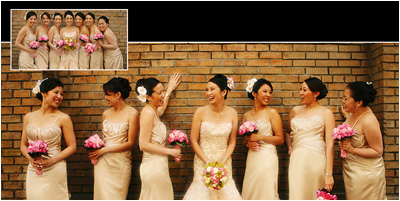 Images On Top of Other Images: Sometimes, smaller images are placed on top of larger images. This has an "inset" effect and is very useful when space is limited on the page. It may also be used to convey sequence actions. Images On Top of Other Images: Sometimes, smaller images are placed on top of larger images. This has an "inset" effect and is very useful when space is limited on the page. It may also be used to convey sequence actions.
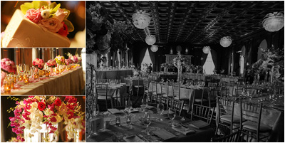
 Design Elements using Blocks / Bars: Images do not always fit perfectly into a given page spread - in such instances, bars may be used to fill up the rest of the space. These bars also provide a framing for the images. Similarly, blocks may used when a collection of images do not form a complete rectangular shape. Design Elements using Blocks / Bars: Images do not always fit perfectly into a given page spread - in such instances, bars may be used to fill up the rest of the space. These bars also provide a framing for the images. Similarly, blocks may used when a collection of images do not form a complete rectangular shape.
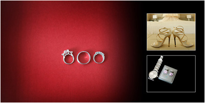
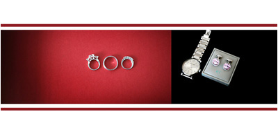 Color Elements: Color elements are sometimes used to enhance existing images. Usually, colors are selected within the images themselves (e.g. flowers, dress colors, etc). When used properly, color elements do not distract; instead, they compliment the design. Color Elements: Color elements are sometimes used to enhance existing images. Usually, colors are selected within the images themselves (e.g. flowers, dress colors, etc). When used properly, color elements do not distract; instead, they compliment the design.
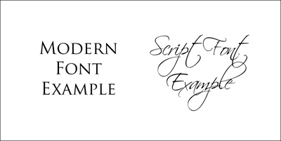 Fonts: The choice of fonts at the beginning of an album design establishes a tone for the design. Romanesque fonts convey a classic and formal feeling; whereas script fonts hint a softer, romantic feel. Fonts: The choice of fonts at the beginning of an album design establishes a tone for the design. Romanesque fonts convey a classic and formal feeling; whereas script fonts hint a softer, romantic feel.
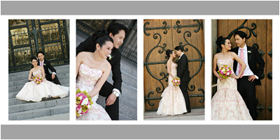
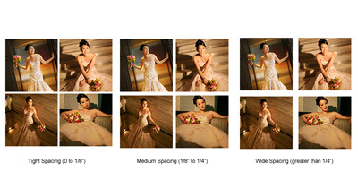 Spacing Between Images: Spacing between images is important in a design. It gives personality in a layout. Often times, when designing clean and modern, designers will either use medium or tight spacing to create a pristine and elegant look. Spacing Between Images: Spacing between images is important in a design. It gives personality in a layout. Often times, when designing clean and modern, designers will either use medium or tight spacing to create a pristine and elegant look.
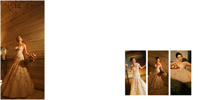 Negative Space: The use of negative space gives great impact to an album design. When used properly, they allow the viewer to admire the individual images without distraction from other elements. Negative Space: The use of negative space gives great impact to an album design. When used properly, they allow the viewer to admire the individual images without distraction from other elements.
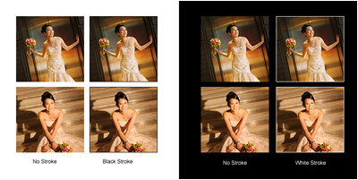 Strokes / Borders: Strokes around images provide a visual boundary and framing for the images. This is especially important when lighter images are used on white backgrounds, or when darker images are used on black backgrounds. Without strokes, these images will appear to bleed into the background with no boundary. Strokes / Borders: Strokes around images provide a visual boundary and framing for the images. This is especially important when lighter images are used on white backgrounds, or when darker images are used on black backgrounds. Without strokes, these images will appear to bleed into the background with no boundary.
 Embellishments: Careful use of embellishments can compliment the tone of the album. Often, embellishments are chosen to match either the feel or pattern of the images. Embellishments: Careful use of embellishments can compliment the tone of the album. Often, embellishments are chosen to match either the feel or pattern of the images.
|